Table of Contents
jSlider
The jSlider control is analogous the .Net Compact Framework's TrackBar, but has a much more rich appearance, and a few additional features.
CornerRadii Property
The CornerRadii property sets the shape of the 4 corners of both the thumb and the track together when the Shape Property is Rectangular. Each corner can be set independently.
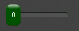
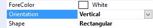
Orientation Property
The Orientation property can be used to display the slider horizontally or vertically.
 |  |
 |  |
Minimum Property
The Minimum property sets the lower bound of the Value property.
Maximum Property
The Maximum property sets the upper bound of the Value property.
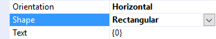
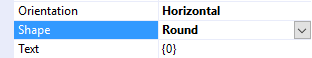
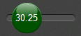
Shape Property
The Shape property can be used to select the overall shape of the slider: Rectangular or Round
|  |
 |  |
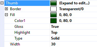
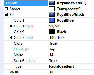
Thumb Property
The Thumb property is used to customize the appearance of the slider's thumb (a.k.a handle). It uses the same features described in Fills, Strokes, and Borders and Highlights and Gloss.
 |  |
 |  |
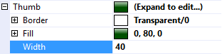
Width Property
The Width property sets the width of the thumb. It is only applicable if the Shape Property is set to Rectangular.
|  |
 |  |
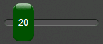
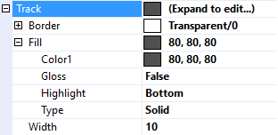
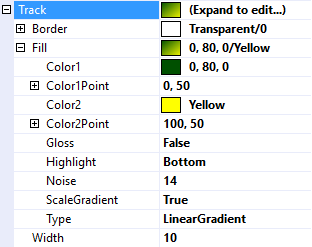
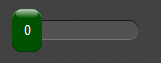
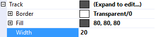
Track Property
The Track property is used to customize the appearance of the track that the thumb slides along. It uses the same features described in Fills, Strokes, and Borders and Highlights and Gloss.
 |  |
 |  |
Width Property
As the name implies, the Width property can be used to set the width of the track.
|  |
 |  |
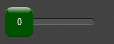
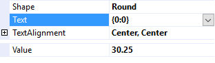
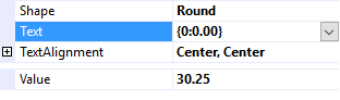
Text Property
The Text property is a .Net format string that specifies the text to display on the thumb. The only argument, {0}, is the value of the Value Property.
 |  |
 |  |
Text Features
jSlider employs the same text features used by many of the other controls in the jControls CF35 library including ForeColor, TextOffset, TextAlignment, and TextWrap. See Text Features for more information.
Value Property
The Value property gets or sets the position of the slider. An exception will be thrown if attempting to set it outside of the range specified by the Minimum property and the Maximum property.
ValueChanged Event
The ValueChanged event fires any time the Value property changes, and can therefore be used to respond to the operator moving the slider.