Table of Contents
jCheckBox
The jCheckBox control is analogous to the .NET WinForm's CheckBox, but has a much more rich appearance, employing jControls' fill, border, shape, corner radii, drop shadow, and text features.
Checked Property
The Checked property changes the checkbox's state to either checked (true) or unchecked (false).
CheckedChanged Event
The CheckedChanged event fires any time the Checked property changes, and can therefore be used to respond to operator input.
Group Property
The Group property places the control into a mutually exclusive group. In the video below jCheckBox1, 2, and 3 are placed into one group, while jCheckBox4, 5, and 6 are placed into another group.
Group names are visible application-wide, so please be sure each group name is unique across the entire application.
CheckedAppearance Property
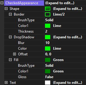
The CheckedAppearance property describes the appearance of the check box when the control is in the checked state.
UncheckedAppearance Property
The UncheckedAppearance property describes the appearance of the check box when the control is in the unchecked state.
Checkmark Property
The Checkmark property describes the appearance of the checkmark that is displayed when the control is in the checked state.
The Padding property adds space between the edges of the check box and the checkmark.
GetCheckPath() Method
The GetCheckPath() method can be used to customize the shape or glyph that is the checkbox. For example the following code will create an X that will be drawn when the control is in the checked state.
public class XCheckbox : jCheckBox
{
    protected override string GetCheckPath()
    {
        return "M3,20 L20,3 L50,33 L80,3 L97,20 L67,50 L97,80 L80,97 L50,67 L20,97 L3,80 L33,50 Z";
    }
}
The shape is defined using the SVG path command syntax.


