
Table of Contents
jButton
The jButton control is analogous the .Net Compact Framework's Button, but has a much more rich appearance, and a few additional features.
CornerRadii Property
The CornerRadii property can be used to set shape of the button's four corners when the Shape property is set to Rectangular. Each corner can be set independently.
PressedAppearance and ReleasedAppearance Properties
The PressedAppearance property describes the appearance of the jButton when it is pressed, and the ReleasedAppearance property describes the appearance of the jButton when it is not pressed. With these two properties, developers can create dynamic buttons with visual feedback. These appearance features are described in detail at Fills, Strokes, and Borders.
 |
These properties also add an additional TextOffset property to create the appearance of movement when the button is pressed.
Latch Property
When the Latch property is true, the button will toggle between pressed and released with each touch, behaving as a toggle button rather than a push button.
IsLatched Property
The IsLatched property can be used at runtime to determine whether or not a button is latched in the pressed state.
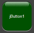
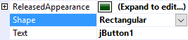
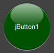
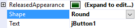
Shape Property
The Shape property can be used to select the overall shape of the button: Rectangular or Round
 |  |
 |  |
Text Features
jButton employs the same text features used by many of the other controls in the jControls CF35 library including ForeColor, TextOffset, TextAlignment, and TextWrap. See Text Features for more information.