Table of Contents
jSwitch
The jSwitch control implements a sliding switch that can toggle between an on and off state.
CornerRadii Property
The CornerRadii property sets the shape of the 4 corners of both the thumb and the track together when the Shape Property is Rectangular. Each corner can be set independently.
IsOn Property
The IsOn property changes the switch's state to either on (true) or off (false), and correspondingly the position of the thumb.
 |  |
 |  |
IsOnChanged Event
The IsOnChanged event fires any time the IsOn property changes, and can therefore be used to respond to the operator toggling the switch.
Shape Property
The Shape property can be used to select the overall shape of the slider: Rectangular or Round
 |  |
 |  |
Thumb Property
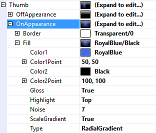
The Thumb property is used to customize the appearance of the switch's thumb (a.k.a handle). It uses the same features described in Fills, Strokes, and Borders and Highlights and Gloss.
It is divided into OffAppearance and OnAppearance properties so the appearance can be customized according on the value of the IsOn property.
 |  |
 |  |
ShowText Property
Track Property
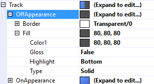
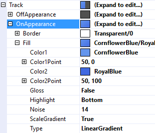
The Track property is used to customize the appearance of the track that the thumb slides along. It uses the same features described in Fills, Strokes, and Borders and Highlights and Gloss.
 |  |
 |  |
ShowText Property
Text Property
The Text property is a .Net format string that specifies the text to display on the thumb or the track. The only argument, {0}, is the value of the IsOn Property.
 |  |
 |  |
Text Features
jSwitch employs the same text features used by many of the other controls in the jControls CF35 library including ForeColor, TextOffset, TextAlignment, and TextWrap. See Text Features for more information.


